 Try Jupyter Widgets
Layout of Jupyter widgets#
This notebook presents how to layout Jupyter interactive widgets to build rich and reactive widget-based applications.
You can jump directly to these sections:
The layout attribute#
Jupyter interactive widgets have a layout attribute exposing a number of CSS properties that impact how widgets are laid out.
Exposed CSS properties#
Sizes#
heightwidthmax_heightmax_widthmin_heightmin_width
Display#
visibilitydisplayoverflow
Box model#
bordermarginpadding
Positioning#
topleftbottomright
Flexbox#
orderflex_flowalign_itemsflexalign_selfalign_contentjustify_content
Grid layout#
grid_auto_columnsgrid_auto_flowgrid_auto_rowsgrid_gapgrid_templategrid_rowgrid_column
Shorthand CSS properties#
You may have noticed that certain CSS properties such as margin-[top/right/bottom/left] seem to be missing. The same holds for padding-[top/right/bottom/left] etc.
In fact, you can atomically specify [top/right/bottom/left] margins via the margin attribute alone by passing the string '100px 150px 100px 80px' for a respectively top, right, bottom and left margins of 100, 150, 100 and 80 pixels.
Similarly, the flex attribute can hold values for flex-grow, flex-shrink and flex-basis. The border attribute is a shorthand property for border-width, border-style (required), and border-color.
Simple examples#
The following example shows how to resize a Button so that its views have a height of 80px and a width of 50% of the available space:
from ipywidgets import Button, Layout

b = Button(description='(50% width, 80px height) button',
           layout=Layout(width='50%', height='80px'))
b
The layout property can be shared between multiple widgets and assigned directly.
Button(description='Another button with the same layout', layout=b.layout)
Description#
You may have noticed that long descriptions are truncated. This is because the description length is, by default, fixed.
from ipywidgets import IntSlider

IntSlider(description='A too long description')
You can change the length of the description to fit the description text. However, this will make the widget itself shorter. You can change both by adjusting the description width and the widget width using the widget’s style.
style = {'description_width': 'initial'}
IntSlider(description='A too long description', style=style)
If you need more flexibility to lay out widgets and descriptions, you can use Label widgets directly.
from ipywidgets import HBox, Label

HBox([Label('A too long description'), IntSlider()])
Natural sizes, and arrangements using HBox and VBox#
Most of the core-widgets have default heights and widths that tile well together. This allows simple layouts based on the HBox and VBox helper functions to align naturally:
from ipywidgets import Button, HBox, VBox

words = ['correct', 'horse', 'battery', 'staple']
items = [Button(description=w) for w in words]
left_box = VBox([items[0], items[1]])
right_box = VBox([items[2], items[3]])
HBox([left_box, right_box])
Latex#
Widgets such as sliders and text inputs have a description attribute that can render Latex Equations. The Label widget also renders Latex equations.
from ipywidgets import IntSlider, Label
IntSlider(description=r'\(\int_0^t f\)')
Label(value=r'\(e=mc^2\)')
Number formatting#
Sliders have a readout field which can be formatted using Python’s Format Specification Mini-Language. If the space available for the readout is too narrow for the string representation of the slider value, a different styling is applied to show that not all digits are visible.
The Flexbox layout#
The HBox and VBox classes above are special cases of the Box widget.
The Box widget enables the entire CSS flexbox spec as well as the Grid layout spec, enabling rich reactive layouts in the Jupyter notebook. It aims at providing an efficient way to lay out, align and distribute space among items in a container.
Again, the whole flexbox spec is exposed via the layout attribute of the container widget (Box) and the contained items. One may share the same layout attribute among all the contained items.
Acknowledgement#
The following flexbox tutorial on the flexbox layout follows the lines of the article A Complete Guide to Flexbox by Chris Coyier, and uses text and various images from the article with permission.
Basics and terminology#
Since flexbox is a whole module and not a single property, it involves a lot of things including its whole set of properties. Some of them are meant to be set on the container (parent element, known as “flex container”) whereas the others are meant to be set on the children (known as “flex items”).
If regular layout is based on both block and inline flow directions, the flex layout is based on “flex-flow directions”. Please have a look at this figure from the specification, explaining the main idea behind the flex layout.
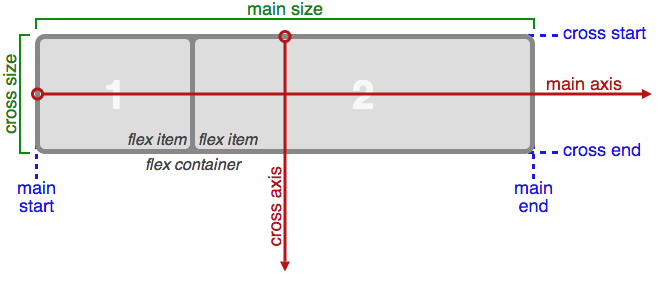
Basically, items will be laid out following either the main axis (from main-start to main-end) or the cross axis (from cross-start to cross-end).
main axis- The main axis of a flex container is the primary axis along which flex items are laid out. Beware, it is not necessarily horizontal; it depends on the flex-direction property (see below).main-start | main-end- The flex items are placed within the container starting from main-start and going to main-end.main size- A flex item’s width or height, whichever is in the main dimension, is the item’s main size. The flex item’s main size property is either the ‘width’ or ‘height’ property, whichever is in the main dimension. cross axis - The axis perpendicular to the main axis is called the cross axis. Its direction depends on the main axis direction.cross-start | cross-end- Flex lines are filled with items and placed into the container starting on the cross-start side of the flex container and going toward the cross-end side.cross size- The width or height of a flex item, whichever is in the cross dimension, is the item’s cross size. The cross size property is whichever of ‘width’ or ‘height’ that is in the cross dimension.
Properties of the parent#

display#
display can be flex or inline-flex. This defines a flex container (block or inline).
flex-flow#
flex-flow is a shorthand for the flex-direction and flex-wrap properties, which together define the flex container’s main and cross axes. Default is row nowrap.
flex-direction(column-reverse | column | row | row-reverse )This establishes the main-axis, thus defining the direction flex items are placed in the flex container. Flexbox is (aside from optional wrapping) a single-direction layout concept. Think of flex items as primarily laying out either in horizontal rows or vertical columns.

flex-wrap(nowrap | wrap | wrap-reverse)By default, flex items will all try to fit onto one line. You can change that and allow the items to wrap as needed with this property. Direction also plays a role here, determining the direction new lines are stacked in.

justify-content#
justify-content can be one of flex-start, flex-end, center, space-between, space-around. This defines the alignment along the main axis. It helps distribute extra free space left over when either all the flex items on a line are inflexible, or are flexible but have reached their maximum size. It also exerts some control over the alignment of items when they overflow the line.

align-items#
align-items can be one of flex-start, flex-end, center, baseline, stretch. This defines the default behavior for how flex items are laid out along the cross axis on the current line. Think of it as the justify-content version for the cross-axis (perpendicular to the main-axis).

align-content#
align-content can be one of flex-start, flex-end, center, baseline, stretch. This aligns a flex container’s lines within when there is extra space in the cross-axis, similar to how justify-content aligns individual items within the main-axis.

Note: this property has no effect when there is only one line of flex items.
Properties of the items#

The flexbox-related CSS properties of the items have no impact if the parent element is not a flexbox container (i.e. has a display attribute equal to flex or inline-flex).
order#
By default, flex items are laid out in the source order. However, the order property controls the order in which they appear in the flex container.

flex#
flex is shorthand for three properties, flex-grow, flex-shrink and flex-basis combined. The second and third parameters (flex-shrink and flex-basis) are optional. Default is 0 1 auto.
flex-growThis defines the ability for a flex item to grow if necessary. It accepts a unitless value that serves as a proportion. It dictates what amount of the available space inside the flex container the item should take up.
If all items have flex-grow set to 1, the remaining space in the container will be distributed equally to all children. If one of the children a value of 2, the remaining space would take up twice as much space as the others (or it will try to, at least).

flex-shrinkThis defines the ability for a flex item to shrink if necessary.
flex-basisThis defines the default size of an element before the remaining space is distributed. It can be a length (e.g.
20%,5rem, etc.) or a keyword. Theautokeyword means “look at my width or height property”.
align-self#
align-self allows the default alignment (or the one specified by align-items) to be overridden for individual flex items.

The VBox and HBox helpers#
The VBox and HBox helper classes provide simple defaults to arrange child widgets in vertical and horizontal boxes. They are roughly equivalent to:
def VBox(*pargs, **kwargs):
    """Displays multiple widgets vertically using the flexible box model."""
    box = Box(*pargs, **kwargs)
    box.layout.display = 'flex'
    box.layout.flex_flow = 'column'
    box.layout.align_items = 'stretch'
    return box

def HBox(*pargs, **kwargs):
    """Displays multiple widgets horizontally using the flexible box model."""
    box = Box(*pargs, **kwargs)
    box.layout.display = 'flex'
    box.layout.align_items = 'stretch'
    return box
Examples#
Four buttons in a VBox. Items stretch to the maximum width, in a vertical box taking 50% of the available space.
from ipywidgets import Layout, Button, Box

items_layout = Layout( width='auto')     # override the default width of the button to 'auto' to let the button grow

box_layout = Layout(display='flex',
                    flex_flow='column',
                    align_items='stretch',
                    border='solid',
                    width='50%')

words = ['correct', 'horse', 'battery', 'staple']
items = [Button(description=word, layout=items_layout, button_style='danger') for word in words]
box = Box(children=items, layout=box_layout)
box
Three buttons in an HBox. Items flex proportionally to their weight.
from ipywidgets import Layout, Button, Box, VBox

# Items flex proportionally to the weight and the left over space around the text
items_auto = [
    Button(description='weight=1; auto', layout=Layout(flex='1 1 auto', width='auto'), button_style='danger'),
    Button(description='weight=3; auto', layout=Layout(flex='3 1 auto', width='auto'), button_style='danger'),
    Button(description='weight=1; auto', layout=Layout(flex='1 1 auto', width='auto'), button_style='danger'),
 ]

# Items flex proportionally to the weight
items_0 = [
    Button(description='weight=1; 0%', layout=Layout(flex='1 1 0%', width='auto'), button_style='danger'),
    Button(description='weight=3; 0%', layout=Layout(flex='3 1 0%', width='auto'), button_style='danger'),
    Button(description='weight=1; 0%', layout=Layout(flex='1 1 0%', width='auto'), button_style='danger'),
 ]
box_layout = Layout(display='flex',
                    flex_flow='row',
                    align_items='stretch',
                    width='70%')
box_auto = Box(children=items_auto, layout=box_layout)
box_0 = Box(children=items_0, layout=box_layout)
VBox([box_auto, box_0])
A more advanced example: a reactive form.
The form is a VBox of width ‘50%’. Each row in the VBox is an HBox, that justifies the content with space between..
from ipywidgets import Layout, Button, Box, FloatText, Textarea, Dropdown, Label, IntSlider

form_item_layout = Layout(
    display='flex',
    flex_flow='row',
    justify_content='space-between'
)

form_items = [
    Box([Label(value='Age of the captain'), IntSlider(min=40, max=60)], layout=form_item_layout),
    Box([Label(value='Egg style'),
         Dropdown(options=['Scrambled', 'Sunny side up', 'Over easy'])], layout=form_item_layout),
    Box([Label(value='Ship size'),
         FloatText()], layout=form_item_layout),
    Box([Label(value='Information'),
         Textarea()], layout=form_item_layout)
]

form = Box(form_items, layout=Layout(
    display='flex',
    flex_flow='column',
    border='solid 2px',
    align_items='stretch',
    width='50%'
))
form
A more advanced example: a carousel.
from ipywidgets import Layout, Button, VBox, Label

item_layout = Layout(height='100px', min_width='40px')
items = [Button(layout=item_layout, description=str(i), button_style='warning') for i in range(40)]
box_layout = Layout(overflow='scroll hidden',
                    border='3px solid black',
                    width='500px',
                    height='',
                    flex_flow='row',
                    display='flex')
carousel = Box(children=items, layout=box_layout)
VBox([Label('Scroll horizontally:'), carousel])
The Grid layout#
The GridBox class is a special case of the Box widget.
The Box widget enables the entire CSS flexbox spec, enabling rich reactive layouts in the Jupyter notebook. It aims at providing an efficient way to lay out, align and distribute space among items in a container.
Again, the whole grid layout spec is exposed via the layout attribute of the container widget (Box) and the contained items. One may share the same layout attribute among all the contained items.
The following flexbox tutorial on the flexbox layout follows the lines of the article A Complete Guide to Grid by Chris House, and uses text and various images from the article with permission.
Basics and browser support#
To get started you have to define a container element as a grid with display: grid, set the column and row sizes with grid-template-rows, grid-template-columns, and grid_template_areas, and then place its child elements into the grid with grid-column and grid-row. Similarly to flexbox, the source order of the grid items doesn’t matter. Your CSS can place them in any order, which makes it super easy to rearrange your grid with media queries. Imagine defining the layout of your entire page, and then completely rearranging it to accommodate a different screen width all with only a couple lines of CSS. Grid is one of the most powerful CSS modules ever introduced.
As of March 2017, most browsers shipped native, unprefixed support for CSS Grid: Chrome (including on Android), Firefox, Safari (including on iOS), and Opera. Internet Explorer 10 and 11 on the other hand support it, but it’s an old implementation with an outdated syntax. The time to build with grid is now!
Important terminology#
Before diving into the concepts of Grid it’s important to understand the terminology. Since the terms involved here are all kinda conceptually similar, it’s easy to confuse them with one another if you don’t first memorize their meanings defined by the Grid specification. But don’t worry, there aren’t many of them.
Grid Container
The element on which display: grid is applied. It’s the direct parent of all the grid items. In this example container is the grid container.
<div class="container">
  <div class="item item-1"></div>
  <div class="item item-2"></div>
  <div class="item item-3"></div>
</div>
Grid Item
The children (e.g. direct descendants) of the grid container. Here the item elements are grid items, but sub-item isn’t.
<div class="container">
  <div class="item"></div>
  <div class="item">
  	<p class="sub-item"></p>
  </div>
  <div class="item"></div>
</div>
Grid Line
The dividing lines that make up the structure of the grid. They can be either vertical (“column grid lines”) or horizontal (“row grid lines”) and reside on either side of a row or column. Here the yellow line is an example of a column grid line.
Grid Track
The space between two adjacent grid lines. You can think of them like the columns or rows of the grid. Here’s the grid track between the second and third row grid lines.
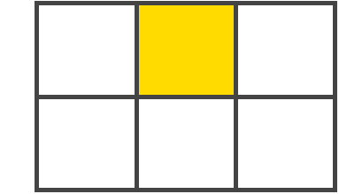
Grid Cell
The space between two adjacent row and two adjacent column grid lines. It’s a single “unit” of the grid. Here’s the grid cell between row grid lines 1 and 2, and column grid lines 2 and 3.
Grid Area
The total space surrounded by four grid lines. A grid area may be comprised of any number of grid cells. Here’s the grid area between row grid lines 1 and 3, and column grid lines 1 and 3.
Properties of the parent#
grid-template-rows, grid-template-colums
Defines the columns and rows of the grid with a space-separated list of values. The values represent the track size, and the space between them represents the grid line.
Values:
<track-size>- can be a length, a percentage, or a fraction of the free space in the grid (using thefrunit)<line-name>- an arbitrary name of your choosing
grid-template-areas
Defines a grid template by referencing the names of the grid areas which are specified with the grid-area property. Repeating the name of a grid area causes the content to span those cells. A period signifies an empty cell. The syntax itself provides a visualization of the structure of the grid.
Values:
<grid-area-name>- the name of a grid area specified withgrid-area.- a period signifies an empty grid cellnone- no grid areas are defined
grid-gap
A shorthand for grid-row-gap and grid-column-gap
Values:
<grid-row-gap>,<grid-column-gap>- length values
where grid-row-gap and grid-column-gap specify the sizes of the grid lines. You can think of it like setting the width of the gutters between the columns / rows.
<line-size>- a length value
Note: The grid- prefix will be removed and grid-gap renamed to gap. The unprefixed property is already supported in Chrome 68+, Safari 11.2 Release 50+ and Opera 54+.
align-items
Aligns grid items along the block (column) axis (as opposed to justify-items which aligns along the inline (row) axis). This value applies to all grid items inside the container.
Values:
start- aligns items to be flush with the start edge of their cellend- aligns items to be flush with the end edge of their cellcenter- aligns items in the center of their cellstretch- fills the whole height of the cell (this is the default)
justify-items
Aligns grid items along the inline (row) axis (as opposed to align-items which aligns along the block (column) axis). This value applies to all grid items inside the container.
Values:
start- aligns items to be flush with the start edge of their cellend- aligns items to be flush with the end edge of their cellcenter- aligns items in the center of their cellstretch- fills the whole width of the cell (this is the default)
align-content
Sometimes the total size of your grid might be less than the size of its grid container. This could happen if all of your grid items are sized with non-flexible units like px. In this case you can set the alignment of the grid within the grid container. This property aligns the grid along the block (column) axis (as opposed to justify-content which aligns the grid along the inline (row) axis).
Values:
start- aligns the grid to be flush with the start edge of the grid containerend- aligns the grid to be flush with the end edge of the grid containercenter- aligns the grid in the center of the grid containerstretch- resizes the grid items to allow the grid to fill the full height of the grid containerspace-around- places an even amount of space between each grid item, with half-sized spaces on the far endsspace-between- places an even amount of space between each grid item, with no space at the far endsspace-evenly- places an even amount of space between each grid item, including the far ends
justify-content
Sometimes the total size of your grid might be less than the size of its grid container. This could happen if all of your grid items are sized with non-flexible units like px. In this case you can set the alignment of the grid within the grid container. This property aligns the grid along the inline (row) axis (as opposed to align-content which aligns the grid along the block (column) axis).
Values:
start- aligns the grid to be flush with the start edge of the grid containerend- aligns the grid to be flush with the end edge of the grid containercenter- aligns the grid in the center of the grid containerstretch- resizes the grid items to allow the grid to fill the full width of the grid containerspace-around- places an even amount of space between each grid item, with half-sized spaces on the far endsspace-between- places an even amount of space between each grid item, with no space at the far endsspace-evenly- places an even amount of space between each grid item, including the far ends
grid-auto-columns, grid-auto-rows
Specifies the size of any auto-generated grid tracks (aka implicit grid tracks). Implicit tracks get created when there are more grid items than cells in the grid or when a grid item is placed outside of the explicit grid. (see The Difference Between Explicit and Implicit Grids)
Values:
<track-size>- can be a length, a percentage, or a fraction of the free space in the grid (using thefrunit)
Properties of the items#
Note: float, display: inline-block, display: table-cell, vertical-align and column-?? properties have no effect on a grid item.
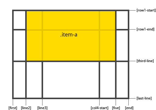
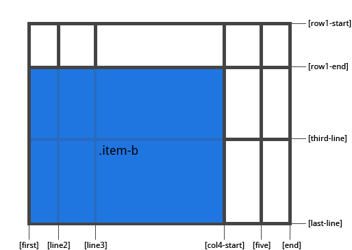
grid-column, grid-row
Determines a grid item’s location within the grid by referring to specific grid lines. grid-column-start/grid-row-start is the line where the item begins, and grid-column-end/grid-row-end is the line where the item ends.
Values:
<line>- can be a number to refer to a numbered grid line, or a name to refer to a named grid linespan <number>- the item will span across the provided number of grid tracksspan <name>- the item will span across until it hits the next line with the provided nameauto- indicates auto-placement, an automatic span, or a default span of one
.item {
  grid-column: <number> | <name> | span <number> | span <name> | auto /
               <number> | <name> | span <number> | span <name> | auto
  grid-row: <number> | <name> | span <number> | span <name> | auto /
            <number> | <name> | span <number> | span <name> | auto
}
Examples:
.item-a {
  grid-column: 2 / five;
  grid-row: row1-start / 3;
}
.item-b {
  grid-column: 1 / span col4-start;
  grid-row: 2 / span 2;
}
If no grid-column / grid-row is declared, the item will span 1 track by default.
Items can overlap each other. You can use z-index to control their stacking order.
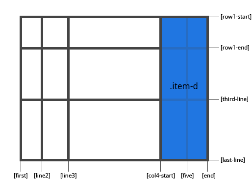
grid-area
Gives an item a name so that it can be referenced by a template created with the grid-template-areas property. Alternatively, this property can be used as an even shorter shorthand for grid-row-start + grid-column-start + grid-row-end + grid-column-end.
Values:
<name>- a name of your choosing<row-start> / <column-start> / <row-end> / <column-end>- can be numbers or named lines
.item {
  grid-area: <name> | <row-start> / <column-start> / <row-end> / <column-end>;
}
Examples:
As a way to assign a name to the item:
.item-d {
  grid-area: header
}
As the short-shorthand for grid-row-start + grid-column-start + grid-row-end + grid-column-end:
.item-d {
  grid-area: 1 / col4-start / last-line / 6
}
justify-self
Aligns a grid item inside a cell along the inline (row) axis (as opposed to align-self which aligns along the block (column) axis). This value applies to a grid item inside a single cell.
Values:
start- aligns the grid item to be flush with the start edge of the cellend- aligns the grid item to be flush with the end edge of the cellcenter- aligns the grid item in the center of the cellstretch- fills the whole width of the cell (this is the default)
.item {
  justify-self: start | end | center | stretch;
}
Examples:
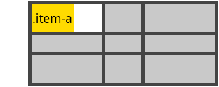
.item-a {
  justify-self: start;
}
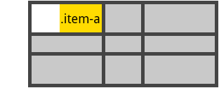
.item-a {
  justify-self: end;
}
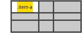
.item-a {
  justify-self: center;
}
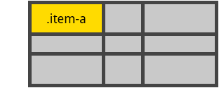
.item-a {
  justify-self: stretch;
}
To set alignment for all the items in a grid, this behavior can also be set on the grid container via the justify-items property.
from ipywidgets import Button, GridBox, Layout, ButtonStyle
Placing items by name:
header  = Button(description='Header',
                 layout=Layout(width='auto', grid_area='header'),
                 style=ButtonStyle(button_color='lightblue'))
main    = Button(description='Main',
                 layout=Layout(width='auto', grid_area='main'),
                 style=ButtonStyle(button_color='moccasin'))
sidebar = Button(description='Sidebar',
                 layout=Layout(width='auto', grid_area='sidebar'),
                 style=ButtonStyle(button_color='salmon'))
footer  = Button(description='Footer',
                 layout=Layout(width='auto', grid_area='footer'),
                 style=ButtonStyle(button_color='olive'))

GridBox(children=[header, main, sidebar, footer],
        layout=Layout(
            width='50%',
            grid_template_rows='auto auto auto',
            grid_template_columns='25% 25% 25% 25%',
            grid_template_areas='''
            "header header header header"
            "main main . sidebar "
            "footer footer footer footer"
            ''')
       )
Setting up row and column template and gap
GridBox(children=[Button(layout=Layout(width='auto', height='auto'),
                         style=ButtonStyle(button_color='darkseagreen')) for i in range(9)
                 ],
        layout=Layout(
            width='50%',
            grid_template_columns='100px 50px 100px',
            grid_template_rows='80px auto 80px',
            grid_gap='5px 10px')
       )
Image layout and sizing#
The layout and sizing of images is a little different than for other elements for a combination of historical reasons (the HTML tag img existed before CSS) and practical reasons (an image has an intrinsic size).
Sizing of images is particularly confusing because there are two plausible ways to specify the size of an image. The Image widget has attributes width and height that correspond to attributes of the same name on the HTML img tag. In addition, the Image widget, like every other widget, has a layout, which also has a width and height.
In addition, some CSS styling is applied to images that is not applied to other widgets: max_width is set to 100% and height is set to auto.
You should not rely on Image.width or Image.height to determine the display width and height of the image widget. Any CSS styling, whether via Image.layout or some other source, will override Image.width and Image.height.
When displaying an Image widget by itself, setting Image.layout.width to the desired width will display the Image widget with the same aspect ratio as the original image.
When placing an Image inside a Box (or HBox or VBox) the result depends on whether a width has been set on the Box. If it has, then the image will be stretched (or compressed) to fit within the box because Image.layout.max_width is 100% so the image fills the container. This will usually not preserve the aspect ratio of image.
Controlling the display of an Image inside a container#
Use Image.layout.object_fit to control how an image is scaled inside a container like a box. The possible values are:
'contain': Fit the image in its content box while preserving the aspect ratio. If any of the container is not covered by the image, the background of the container is displayed. The content box is the size of the container if the container is smaller than the image, or the size of the image if the container is larger.'cover': Fill the content box completely while preserving the aspect ratio of the image, cropping the image if necessary.'fill': Completely fill the content box, stretching/compressing the image as necessary.'none': Do no resizing; image will be clipped by the container.'scale-down': Do the same thing as eithercontainornone, using whichever results in the smaller dispayed image.None(the Python value): Removeobject_fitfrom the layout; effect is same as'fill'.
Use Image.layout.object_position to control how where an image is positioned within a container like a box. The default value ensures that the image is centered in the box. The effect of Image.layout.object_position depends, in some cases, on the value of Image.layout.object_fit.
There are several ways to specify the value for object_position, described below.
Examples of object_fit#
In the example below an image is displayed inside a green box to demonstrate each of the values for object_fit.
To keep the example uniform, define common code here.
from ipywidgets import Layout, Box, VBox, HBox, HTML, Image

fit_options = ['contain', 'cover', 'fill', 'scale-down', 'none', None]

hbox_layout = Layout()
hbox_layout.width = '100%'
hbox_layout.justify_content = 'space-around'

green_box_layout = Layout()
green_box_layout.width = '100px'
green_box_layout.height = '100px'
green_box_layout.border = '2px solid green'


def make_box_for_grid(image_widget, fit):
    """
    Make a VBox to hold caption/image for demonstrating
    option_fit values.
    """
    # Make the caption
    if fit is not None:
        fit_str = "'{}'".format(fit)
    else:
        fit_str = str(fit)

    h = HTML(value='' + str(fit_str) + '')

    # Make the green box with the image widget inside it
    boxb = Box()
    boxb.layout = green_box_layout
    boxb.children = [image_widget]

    # Compose into a vertical box
    vb = VBox()
    vb.layout.align_items = 'center'
    vb.children = [h, boxb]
    return vb

# Use this margin to eliminate space between the image and the box
image_margin = '0 0 0 0'

# Set size of captions in figures below
caption_size = 'h4'
object_fit in a Box smaller than the original image#
The effect of each can be seen in the image below. In each case, the image is in a box with a green border. The original image is 600x300 and the grid boxes in the image are squares. Since the image is wider than the box width, the content box is the size of the container.
with open('images/gaussian_with_grid.png', 'rb') as f:
    im_600_300 = f.read()
boxes = []
for fit in fit_options:
    ib = Image(value=im_600_300)
    ib.layout.object_fit = fit
    ib.layout.margin = image_margin

    boxes.append(make_box_for_grid(ib, fit))

vb = VBox()
h = HTML(value='<{size}>Examples of <code>object_fit</code> with large image</{size}>'.format(size=caption_size))
vb.layout.align_items = 'center'
hb = HBox()
hb.layout = hbox_layout
hb.children = boxes

vb.children = [h, hb]
vb
object_fit in a Box larger than the original image#
The effect of each can be seen in the image below. In each case, the image is in a box with a green border. The original image is 50x25 and the grid boxes in the image are squares.
with open('images/gaussian_with_grid_tiny.png', 'rb') as f:
    im_50_25 = f.read()
boxes = []
for fit in fit_options:
    ib = Image(value=im_50_25)
    ib.layout.object_fit = fit
    ib.layout.margin = image_margin
    boxes.append(make_box_for_grid(ib, fit))

vb = VBox()
h = HTML(value='<{size}>Examples of <code>object_fit</code> with small image</{size}>'.format(size=caption_size))
vb.layout.align_items = 'center'
hb = HBox()
hb.layout = hbox_layout
hb.children = boxes

vb.children = [h, hb]
vb
It may be surprising, given the description of the values for option_fit, that in none of the cases does the image actually fill the box. The reason is that the underlying image is only 50 pixels wide, half the width of the box, so fill and cover mean “fill/cover the content box determined by the size of the image”.
object_fit in a Box larger than the original image: use image layout width 100% to fill container#
If the width of the image’s layout is set to 100% it will fill the box in which it is placed. This example also illustrates the difference between 'contain' and 'scale-down'. The effect of 'scale-down' is either the same as 'contain' or 'none', whichever leads to the smaller displayed image. In this case, the smaller image comes from doing no fitting, so that is what is displayed.
boxes = []
for fit in fit_options:
    ib = Image(value=im_50_25)
    ib.layout.object_fit = fit
    ib.layout.margin = image_margin

    # NOTE WIDTH IS SET TO 100%
    ib.layout.width = '100%'

    boxes.append(make_box_for_grid(ib, fit))

vb = VBox()
h = HTML(value='<{size}>Examples of <code>object_fit</code> with image '
               'smaller than container</{size}>'.format(size=caption_size))
vb.layout.align_items = 'center'
hb = HBox()
hb.layout = hbox_layout
hb.children = boxes

vb.children = [h, hb]
vb
Examples of object_position#
There are several ways to set object position:
Use keywords like
topandleftto describe how the image should be placed in the container.Use two positions, in pixels, for the offset from the top, left corner of the container to the top, left corner of the image. The offset may be positive or negative, and can be used to position the image outside of the box.
Use a percentage for the offset in each direction. The percentage is a the fraction of the vertical or horizontal whitespace around the image if the image is smaller than the container, or the portion of the image outside the container if the image is larger than the container.
A mix of pixel and percent offsets.
A mix of keywords and offsets.
Image scaling as determined by object_fit will take precedence over the positioning in some cases. For example, if object_fit is fill, so that the image is supposed to fill the container without preserving the aspect ratio, then object_position will have no effect because there is effectively no positioning to do.
Another way to think about it is this: object_position specifies how the white space around an image should be distributed in a container if there is white space in a particular direction.
Specifying object_position with keywords#
This form of object_position takes two keywords, one for horizontal position of the image in the container and one for the vertical position, in that order.
The horizontal position must be one of:
'left': the left side of the image should be aligned with the left side of the container'center': the image should be centered horizontally in the container.'right': the right side of the image should be aligned with the right side of the container.
The vertical position must be one of
'top': the top of the image should be aligned with the top of the container.‘
center’: the image should be centered vertically in the container.'bottom': the bottom of the image should be aligned with the bottom of the container.
The effect of each is display below, once for an image smaller than the container and once for an image larger than the container.
In the examples below the object_fit is set to 'none' so that the image is not scaled.
object_fit = 'none'
image_value = [im_600_300, im_50_25]
horz_keywords = ['left', 'center', 'right']
vert_keywords = ['top', 'center', 'bottom']

rows = []
for image, caption  in zip(image_value, ['600 x 300 image', '50 x 25 image']):
    cols = []
    for horz in horz_keywords:
        for vert in vert_keywords:
            ib = Image(value=image)
            ib.layout.object_position = '{horz} {vert}'.format(horz=horz, vert=vert)
            ib.layout.margin = image_margin
            ib.layout.object_fit = object_fit
            # ib.layout.height = 'inherit'
            ib.layout.width = '100%'
            cols.append(make_box_for_grid(ib, ib.layout.object_position))
    hb = HBox()
    hb.layout = hbox_layout
    hb.children = cols
    rows.append(hb)

vb = VBox()

h1 = HTML(value='<{size}><code> object_position </code> by '
                'keyword with large image</{size}>'.format(size=caption_size))
h2 = HTML(value='<{size}><code> object_position </code> by '
                'keyword with small image</{size}>'.format(size=caption_size))

vb.children = [h1, rows[0], h2, rows[1]]
vb.layout.height = '400px'
vb.layout.justify_content = 'space-around'
vb.layout.align_items = 'center'
vb
Specifying object_position with offsets in pixels#
One can specify the offset of the top, left corner of the image from the top, left corner of the container in pixels. The first of the two offsets is horizontal, the second is vertical and either may be negative. Using a large enough offset that the image is outside the container will result in the image being hidden.
The image is scaled first using the value of object_fit (which defaults to fill if nothing is specified) then the offset is applied.
Offsets can be specified from the bottom and/or right side by combining keywords and pixel offsets. For example, right 10px bottom 20px offsets the right side of the image 10px from the right edge of the container and the image bottom 20px from the bottom of the container.
object_fit = ['none', 'contain', 'fill', 'cover']
offset = '20px 10px'
image_value = [im_600_300]

boxes = []
for image, caption  in zip(image_value, ['600 x 300 image', ]):
    for fit in object_fit:
        ib = Image(value=image)
        ib.layout.object_position = offset
        ib.layout.margin = image_margin
        ib.layout.object_fit = fit
        # ib.layout.height = 'inherit'
        ib.layout.width = '100%'
        title = 'object_fit: {}'.format(ib.layout.object_fit)
        boxes.append(make_box_for_grid(ib, title))

vb = VBox()
h = HTML(value='<{size}><code>object_position</code> by '
               'offset {offset} with several '
               '<code>object_fit</code>s with large image</{size}>'.format(size=caption_size,
                                                         offset=offset))
vb.layout.align_items = 'center'
hb = HBox()
hb.layout = hbox_layout
hb.children = boxes

vb.children = [h, hb]
vb
Specifying object_position with offsets as a percentage#
One can specify the offset of the top, left corner of the image from the top, left corner of the container as a percent.The first of the two offsets is horizontal, the second is vertical and either may be negative. Using a large enough offset that the image is outside the container will result in the image being hidden.
The important thing to understand is that this is a percent of the white space in each direction if the image is smaller than the container, so that 50% 50% centers the image.
If the image is larger than the container after scaling using the object_fit, then the offset is a percentage of the overflow of the image outside the container. That means that 50% 50% also centers an image larger than the container. A value of 10% 90% would put 10% of the out-of-container part of the image left of the left edge and 90% of the out-of-container part vertically above the top edge.
As with specifying the object_position by keywords, the object_fit can prevent any offset from being applied to the image.